Digital Photographic Design Creative Portfolio - Fall 2025
By: Alyssa Lindo
This portfolio captures my creative progress throughout the semester. Each project challenged me to think differently, experiment with new tools, and develop my design voice. I’m starting with my favorite assignment, then presenting the remaining projects from strongest to least valuable.
---------------------------------------------------------------------------------------------------------
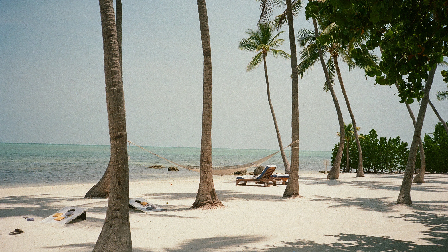
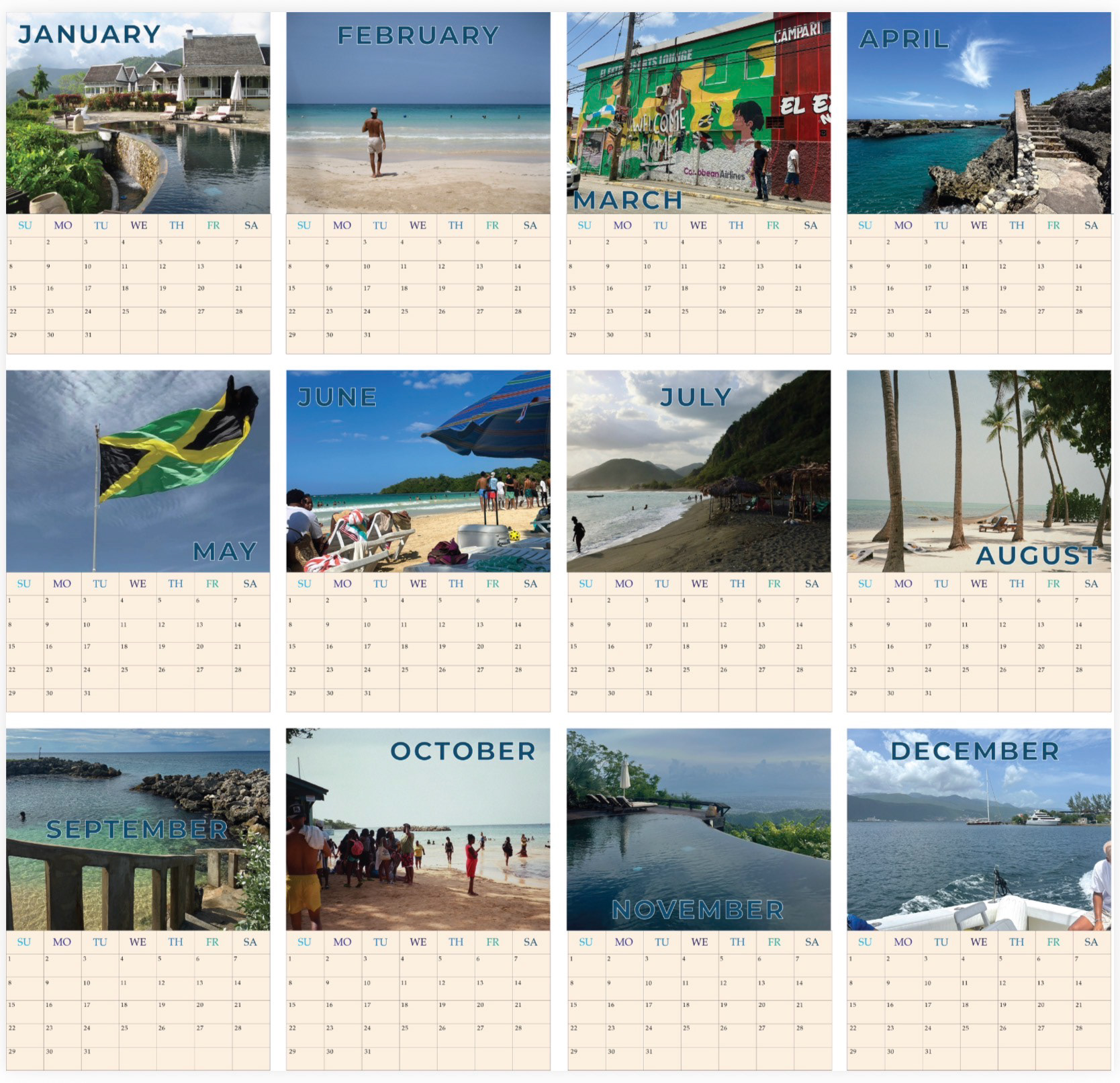
A9 Calendar - Favorite Assignment
Briefing
Create a full 12-month calendar using personal photography. The goal was to design a visually cohesive layout while learning how to work with grids, typography, and consistent formatting across multiple pages.
Tools Used
Adobe InDesign
Adobe Photoshop
iPhone photography
Adobe Photoshop
iPhone photography
My Process
I selected images with strong color, composition, and emotional connection. Then I built a clean monthly grid and repeated the structure for each month, adjusting spacing, alignment, and balance to make sure everything felt unified. I experimented with type placement until it felt modern and minimal.
Reflection
This was my favorite assignment because it blended photography, layout, and storytelling. It taught me how to work with consistency across a multi-page project and helped me understand how design choices build into a full visual system.
---------------------------------------------------------------------------------------------------------
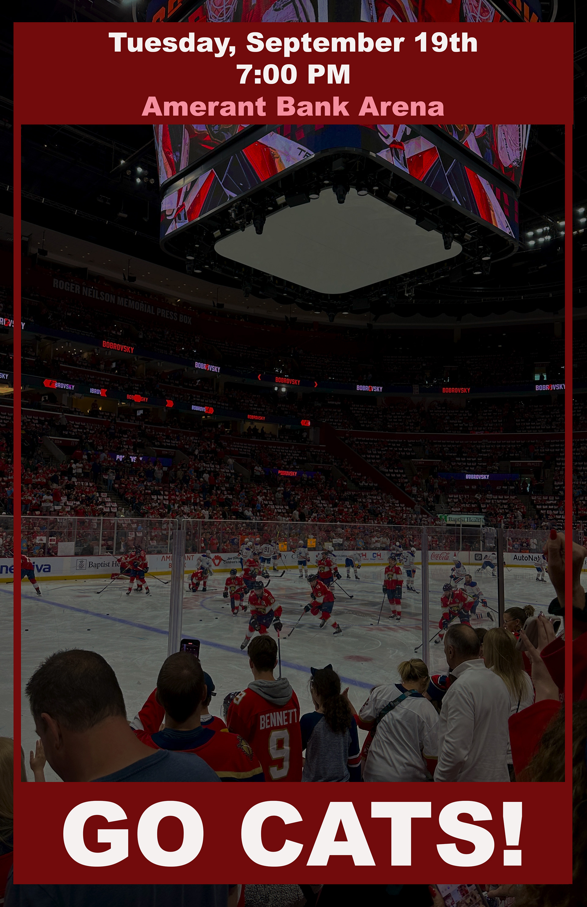
A3 Single Page
Overview
This assignment challenged me to design a bold single-page event poster with strong hierarchy and clear messaging.
Briefing
Design a promotional poster for a Florida Panthers hockey game. The poster needed to include:
• Date
• Time
• Location
• A main headline
• A supporting image
• Date
• Time
• Location
• A main headline
• A supporting image
Tools Used
• Adobe Photoshop
Process
I chose an arena photo for the background to keep the energy of the game. Then I built a layout that places the date and time at the top, the venue in the middle, and a strong “GO CATS!” headline at the bottom. I matched the color palette with the team’s red and white branding.
Reflection
This was a good exercise in hierarchy, typography, and color balance. It helped me understand how to guide the viewer’s eyes through the design in the right order.
---------------------------------------------------------------------------------------------------------
A4 Cover Art
Briefing
The goal of this assignment was to design three different album or podcast cover concepts. Each one needed to communicate a distinct theme through composition, mood, typography, and imagery. The requirement was to experiment with layering, color, blending, and storytelling through a single frame.
Tools Used
Adobe Photoshop
Adobe Illustrator
Photography from personal archives
Image masking, blending, and adjustment layers
Adobe Illustrator
Photography from personal archives
Image masking, blending, and adjustment layers
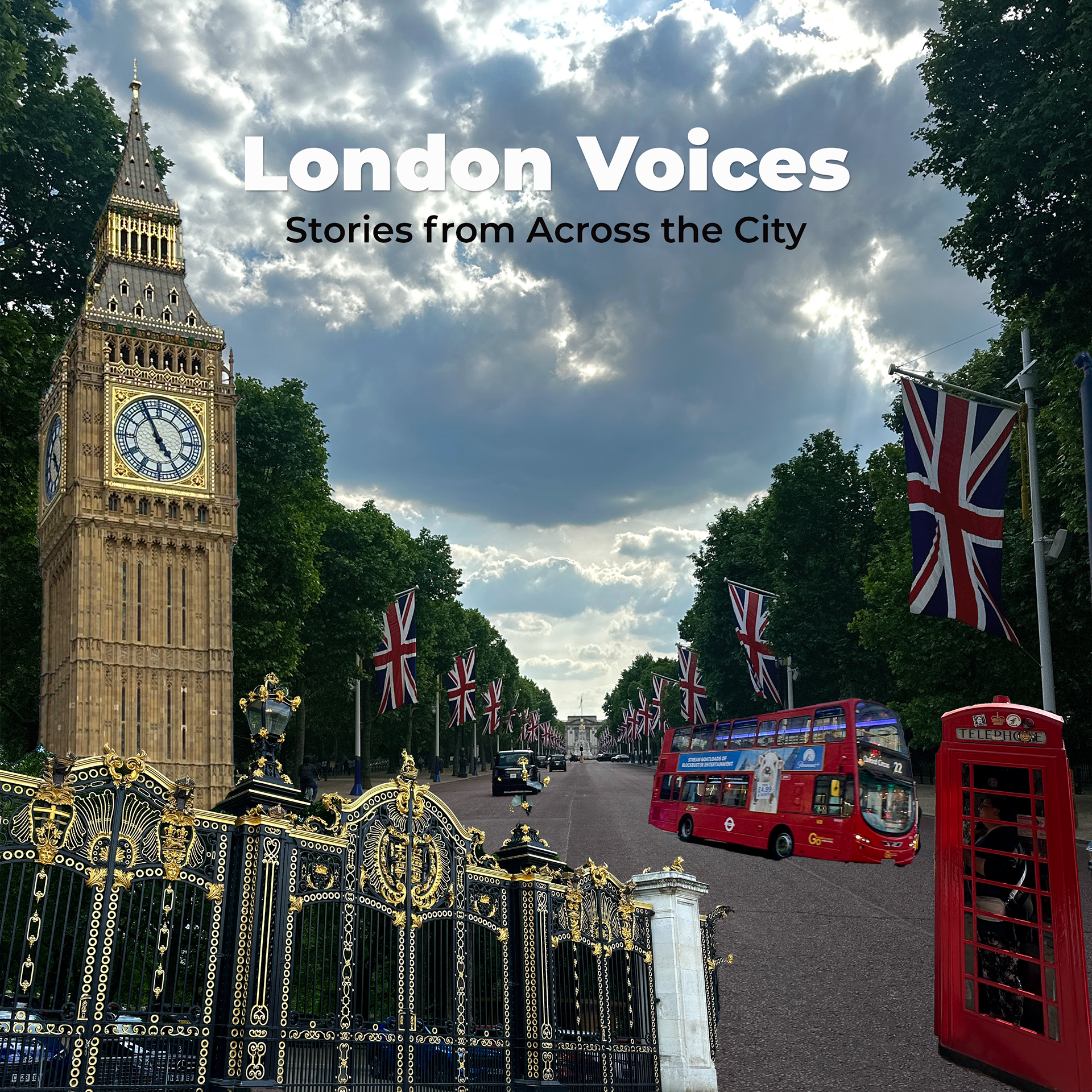
Concept 1: London Voices
This cover was inspired by the feeling of walking through central London while surrounded by the energy of the city. I combined my own photo of Big Ben with elements like Union Jack flags, a red telephone booth, and a double-decker bus to create a dynamic street-level perspective. I focused on realistic compositing, shadow adjustments, and a clean headline treatment.
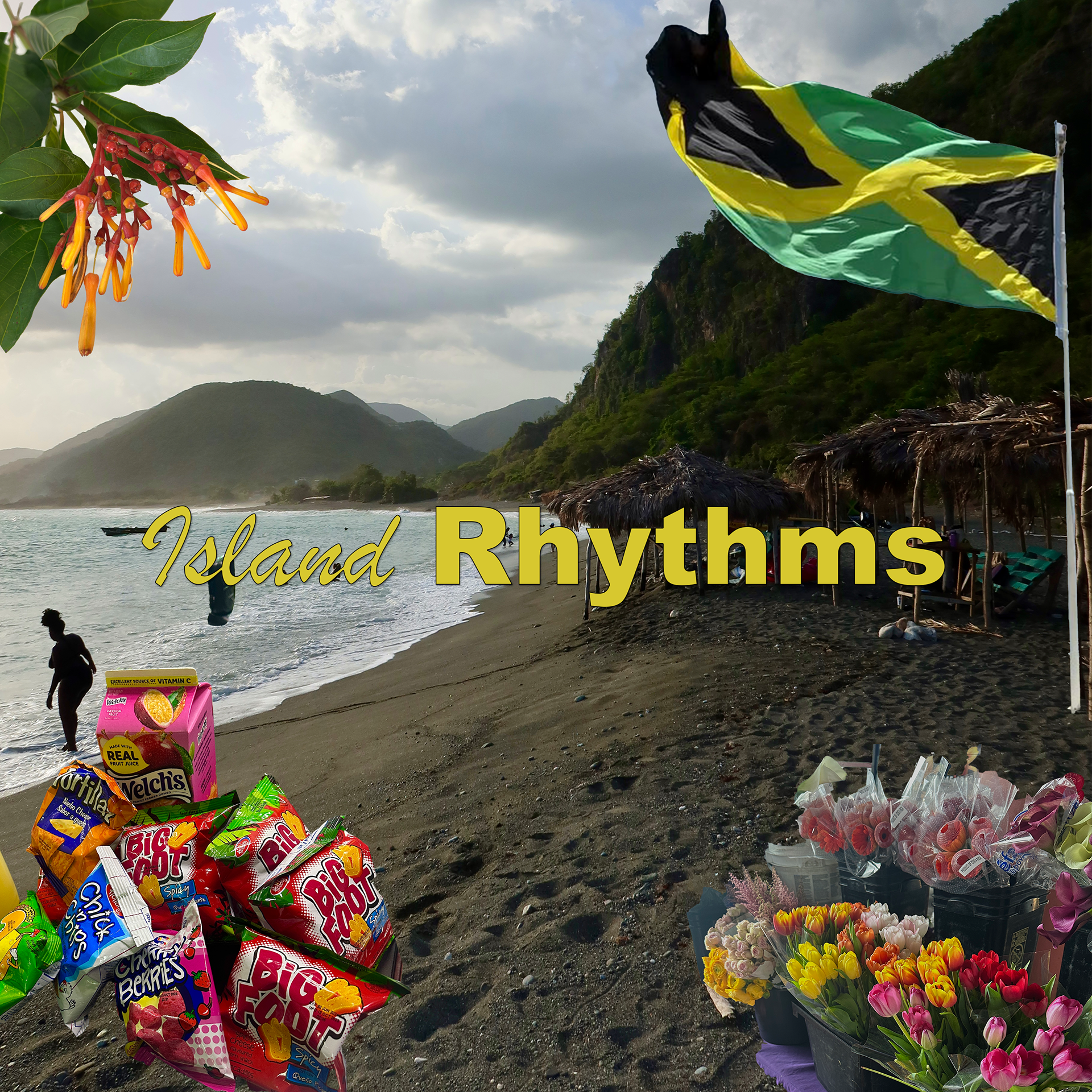
Concept 2: Island Rhythms
This design explores Jamaican culture by blending textures, local snacks, flowers, and a Jamaican flag into a beach scene. The background photo captures authentic island life, and I layered regional elements to highlight the rhythms, colors, and vibrancy of Jamaica. The typography uses warm tones to match the sunset-lit scenery.
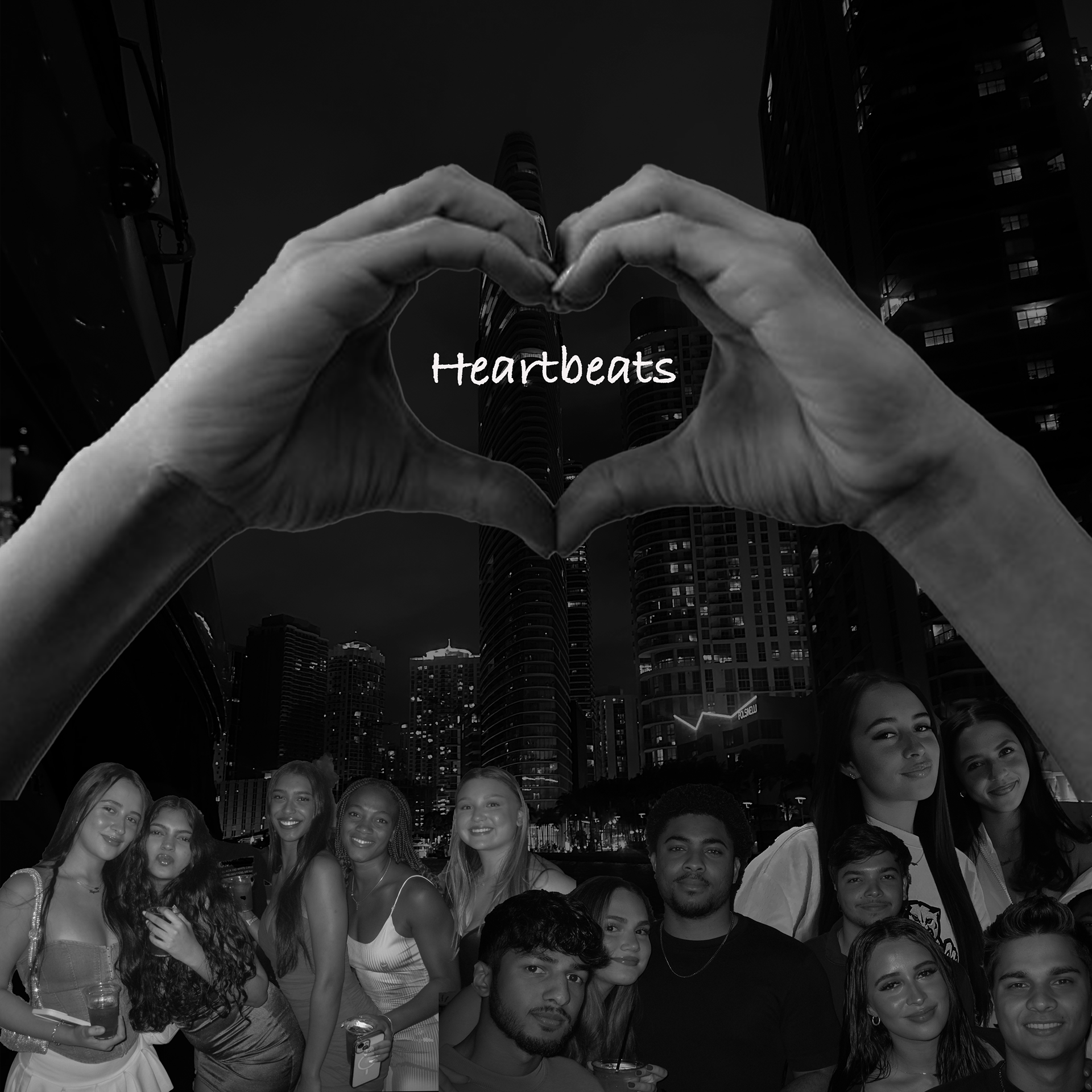
Concept 3: Heartbeats
This cover focuses on emotion and storytelling. I used a nighttime Miami skyline as the backdrop and layered portrait cutouts of friends to create a collage of memories. The heart-shaped hands frame the title, symbolizing connection and shared moments. I worked in black and white to give the piece a cohesive mood and a cinematic feel.
Reflection
This project helped me practice visual storytelling and develop stronger compositing skills. Each cover required a different tone, and working across three concepts pushed me to think about typography, image placement, and atmosphere more deliberately. This assignment strengthened my confidence in creating designs that feel cohesive and intentional.
---------------------------------------------------------------------------------------------------------
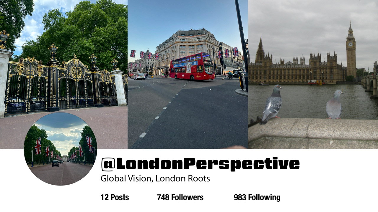
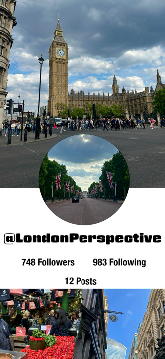
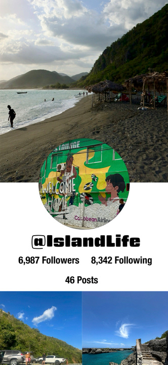
A2 Profile
Briefing
For this assignment, the goal was to design a clean and realistic social media profile page using my own photography. I needed to create a believable feed layout, a profile header, and a consistent visual identity that reflected a specific theme and personality. The challenge was to make the final composition look like an authentic social media account, not just a collage.
For this assignment, the goal was to design a clean and realistic social media profile page using my own photography. I needed to create a believable feed layout, a profile header, and a consistent visual identity that reflected a specific theme and personality. The challenge was to make the final composition look like an authentic social media account, not just a collage.
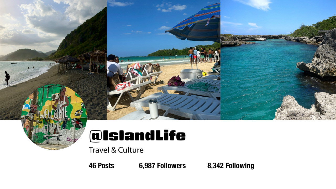
Concept
I created two lifestyle-focused accounts: @IslandLife and @LondonPerspective. Each profile highlights a different environment and visual culture. IslandLife focuses on Jamaican scenery, beaches, and travel culture, while LondonPerspective captures movement, architecture, and street moments from the city.
I created two lifestyle-focused accounts: @IslandLife and @LondonPerspective. Each profile highlights a different environment and visual culture. IslandLife focuses on Jamaican scenery, beaches, and travel culture, while LondonPerspective captures movement, architecture, and street moments from the city.
Process
I began by selecting photographs that represented each theme clearly. For IslandLife, I used wide landscapes, beach textures, and vibrant colors from Jamaica. For LondonPerspective, I worked with images of Big Ben, black cabs, red buses, and city scenes.
I edited all images for consistency in tone, then designed the profile layout by arranging the banner, profile photo, stats, and feed preview in Photoshop. The key was aligning typography, spacing, and image proportions to make the layout feel real and visually balanced.
Tools Used
Adobe Photoshop
iPhone photography
Color grading and masking
Layer organization and layout design
Adobe Photoshop
iPhone photography
Color grading and masking
Layer organization and layout design
Reflection
This assignment strengthened my layout design skills and taught me how to make digital compositions feel cinematic and authentic. It also pushed me to use my own photography more intentionally when designing visual identities. I’m proud of how both profiles look consistent, polished, and believable.
This assignment strengthened my layout design skills and taught me how to make digital compositions feel cinematic and authentic. It also pushed me to use my own photography more intentionally when designing visual identities. I’m proud of how both profiles look consistent, polished, and believable.
---------------------------------------------------------------------------------------------------------
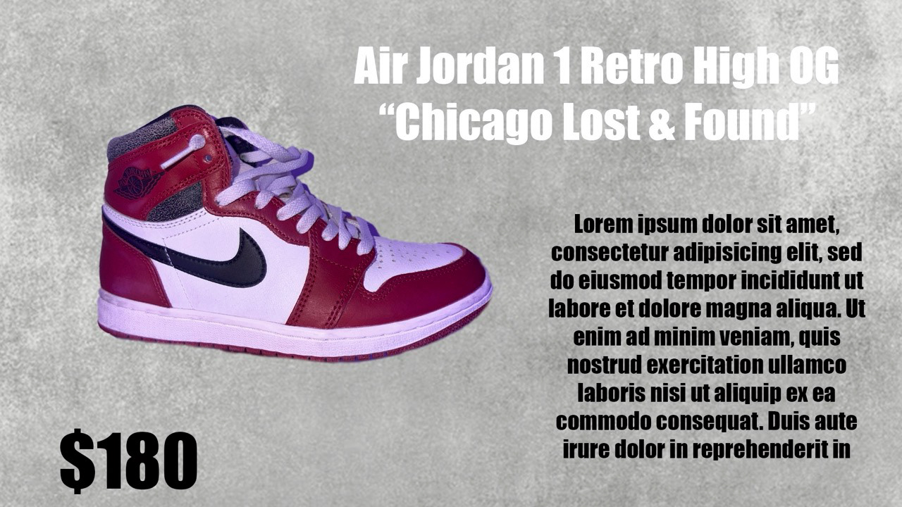
A6 Products for Online Selling: "New to Old"
Briefing
For this assignment, we were required to create a series of product listing graphics for an online store. The goal was to practice visual hierarchy, realistic product cutouts, pricing layout, and consistent brand style. Each product needed a clean background, proper lighting correction, and clear typography. The listings were arranged from the newest release to the oldest release.
Tools Used
Adobe Photoshop
Adobe Illustrator
iPhone camera for product photography
Layer masking and shadow reconstruction
Type hierarchy and spacing controls
Adobe Illustrator
iPhone camera for product photography
Layer masking and shadow reconstruction
Type hierarchy and spacing controls
Process
I started by photographing each shoe against a clean backdrop so the cutouts would be easier to mask. Then I used Photoshop to isolate each sneaker using the Pen Tool and refined mask edges. I applied subtle shadows to make each product feel grounded, and maintained a consistent textured gray backdrop across all slides.
I kept the typography bold, minimal, and readable—mirroring real marketplace listing styles. Prices were placed in large type to create instant clarity for the viewer.
I kept the typography bold, minimal, and readable—mirroring real marketplace listing styles. Prices were placed in large type to create instant clarity for the viewer.
Final Products
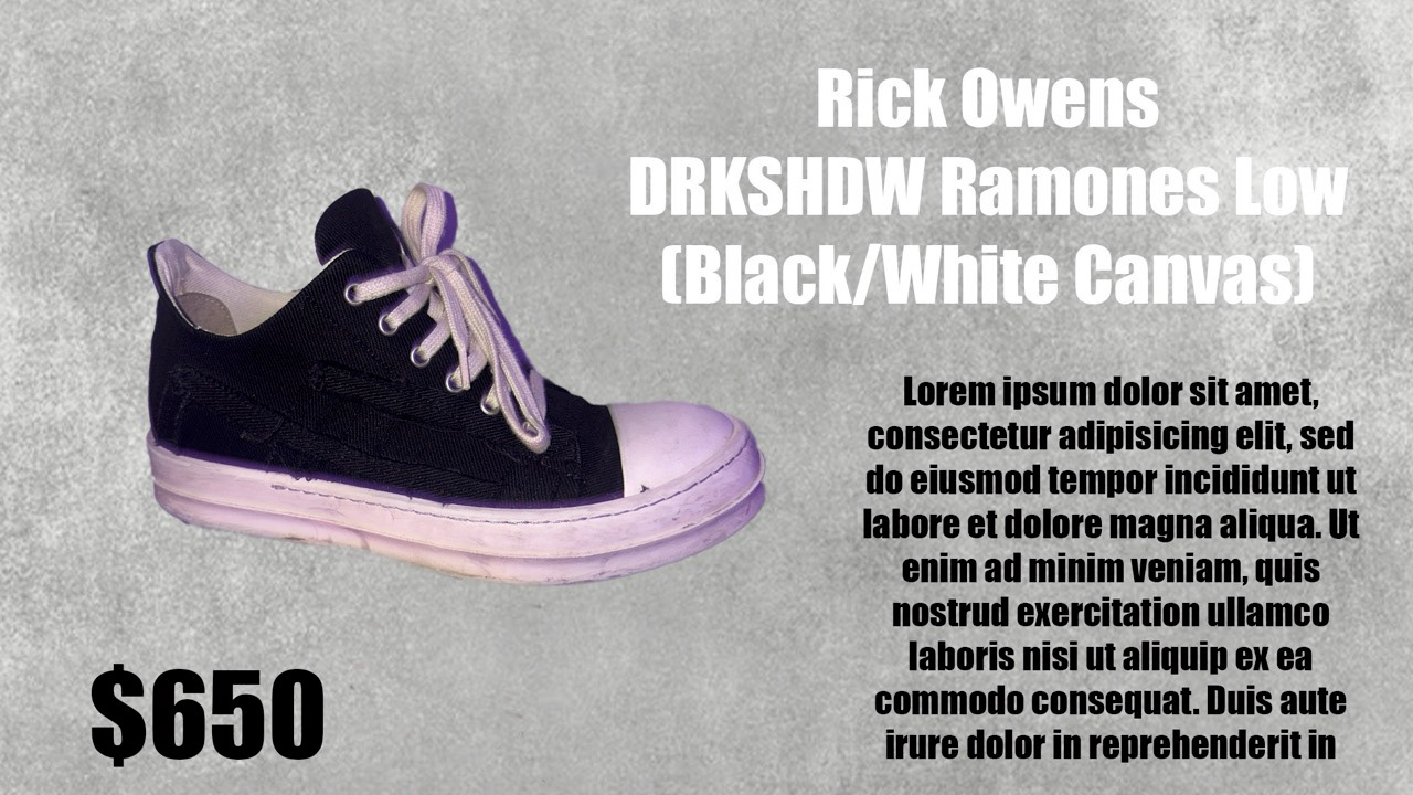
1. Rick Owens DRKSHDW Ramones Low (Black/White Canvas) – $650
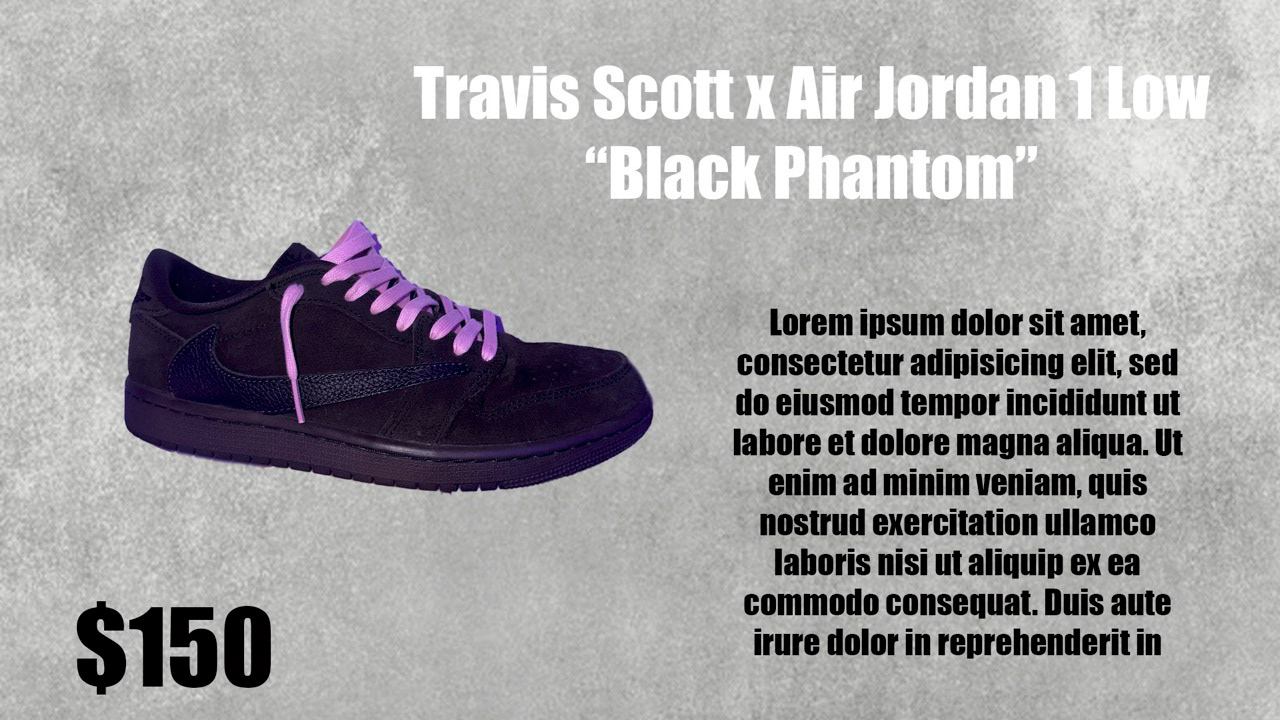
2. Travis Scott x Air Jordan 1 Low “Black Phantom” – $150
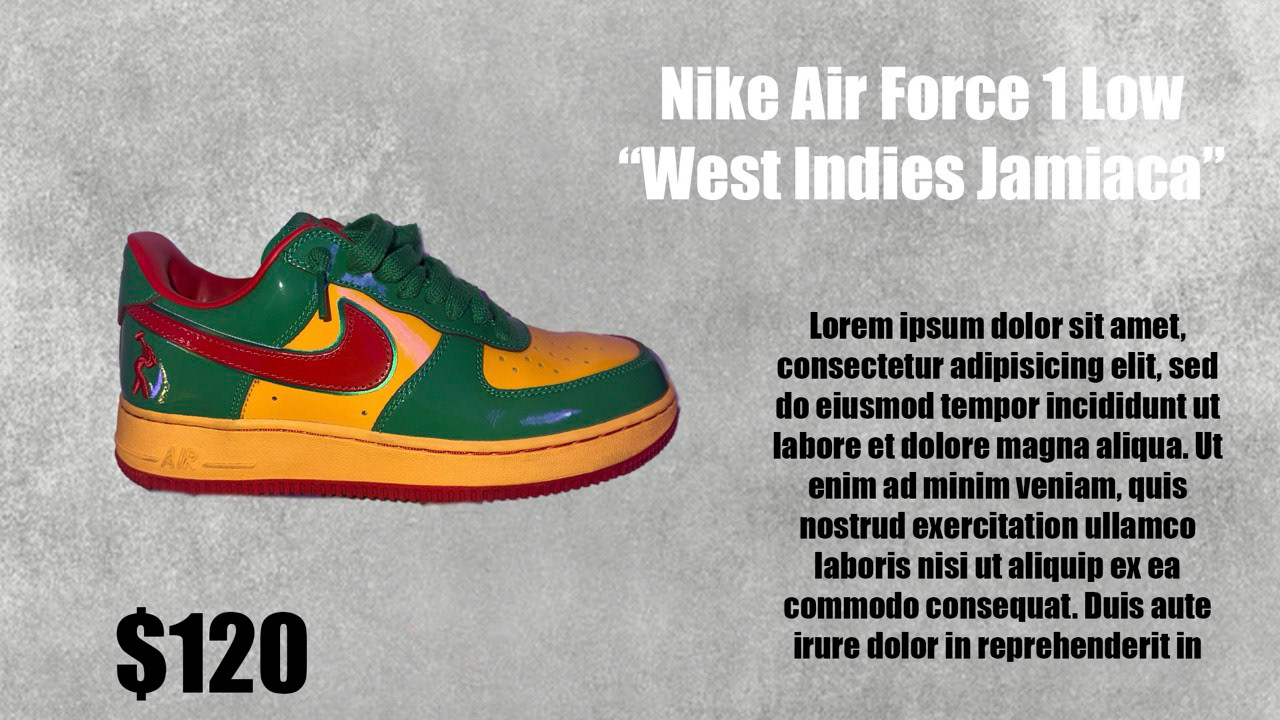
3. Nike Air Force 1 Low “West Indies Jamaica” – $120
4. Maison Margiela Replica Sneaker “Paint Splatter” – $650
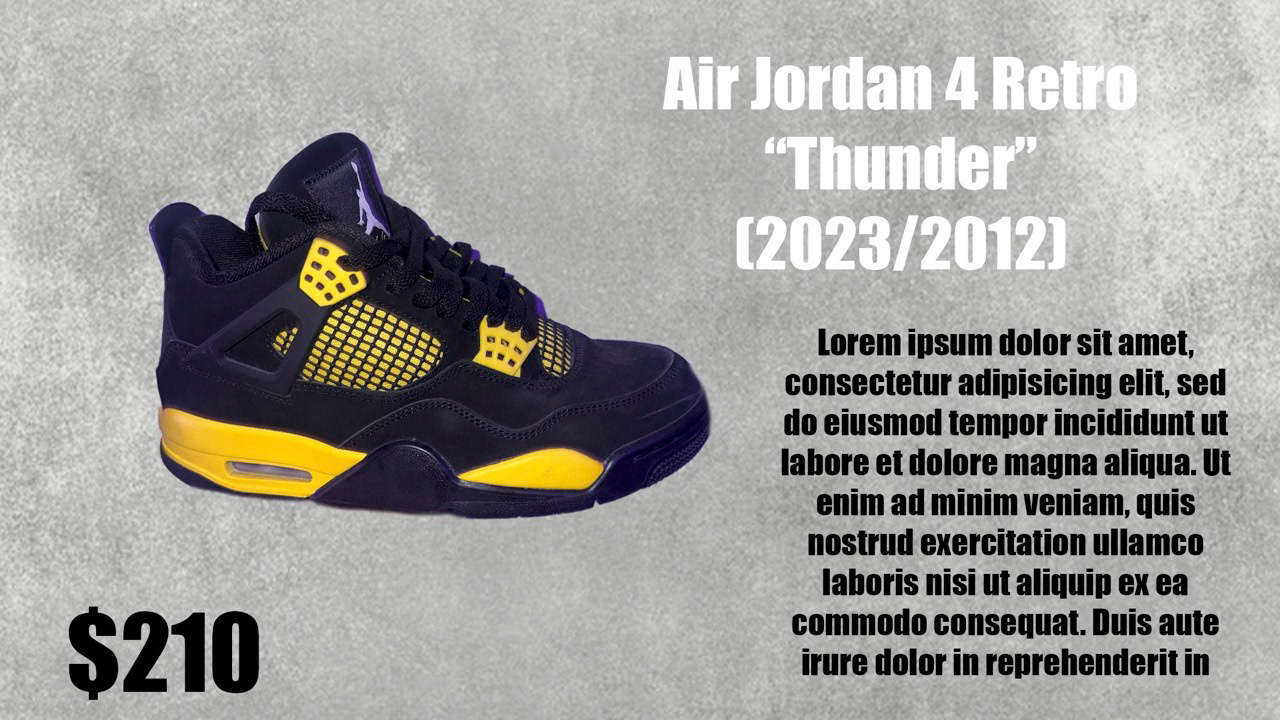
5. Air Jordan 4 Retro “Thunder” (2023/2012) – $210
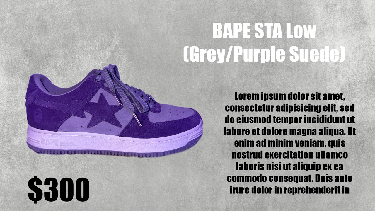
6. BAPE STA Low (Grey/Purple Suede) – $300
7. Air Jordan 1 Retro High OG “Chicago Lost & Found” – $180
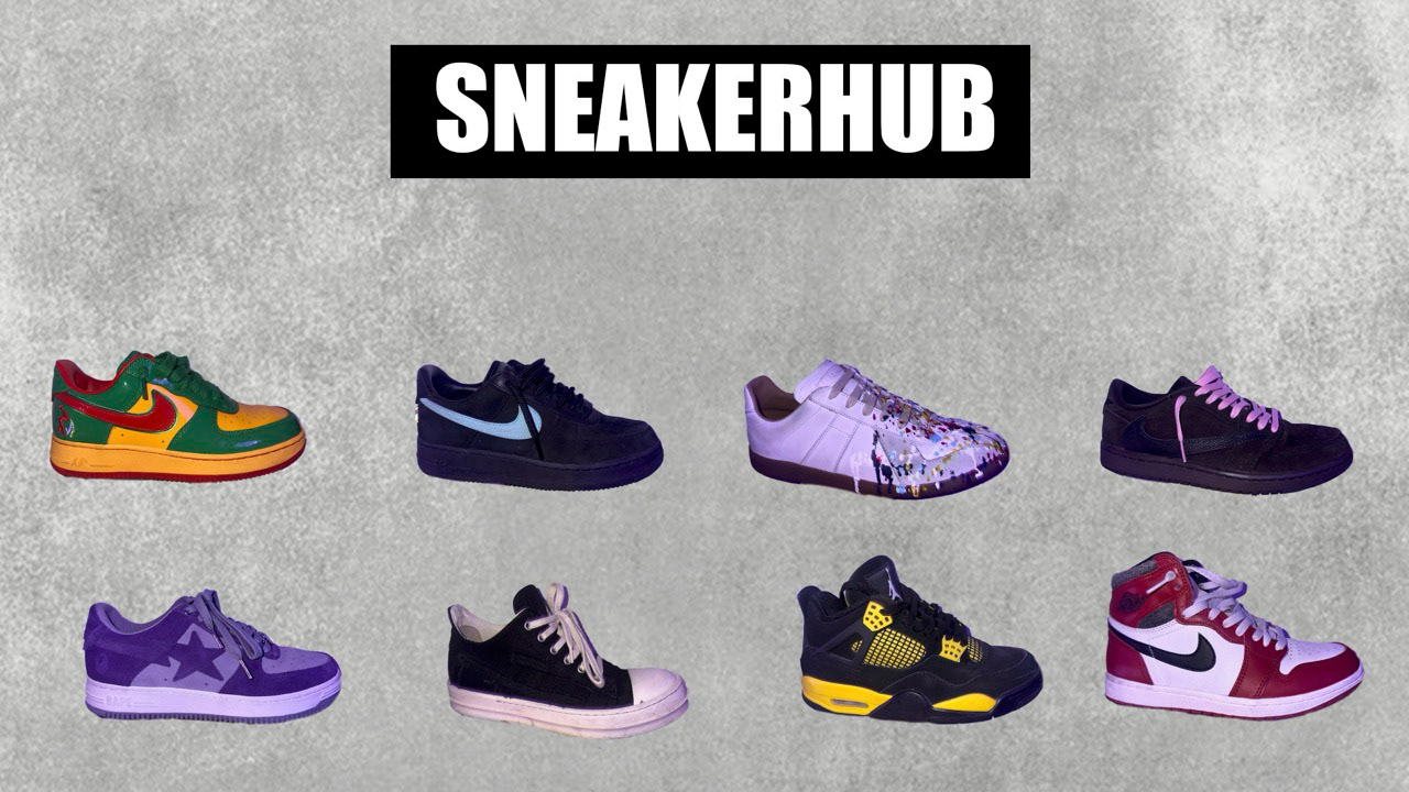
8. SneakerHub Layout (Full Collection Collage)
2. Travis Scott x Air Jordan 1 Low “Black Phantom” – $150
3. Nike Air Force 1 Low “West Indies Jamaica” – $120
4. Maison Margiela Replica Sneaker “Paint Splatter” – $650
5. Air Jordan 4 Retro “Thunder” (2023/2012) – $210
6. BAPE STA Low (Grey/Purple Suede) – $300
7. Air Jordan 1 Retro High OG “Chicago Lost & Found” – $180
8. SneakerHub Layout (Full Collection Collage)
Reflection
This project helped me improve my masking accuracy, shadow cleanup, and understanding of how products should be presented for e-commerce. I also learned how consistent backgrounds and type choices completely change the professionalism of a listing set. Creating a cohesive visual series made the whole collection feel like a real storefront.
---------------------------------------------------------------------------------------------------------
A7 Branding
Briefing
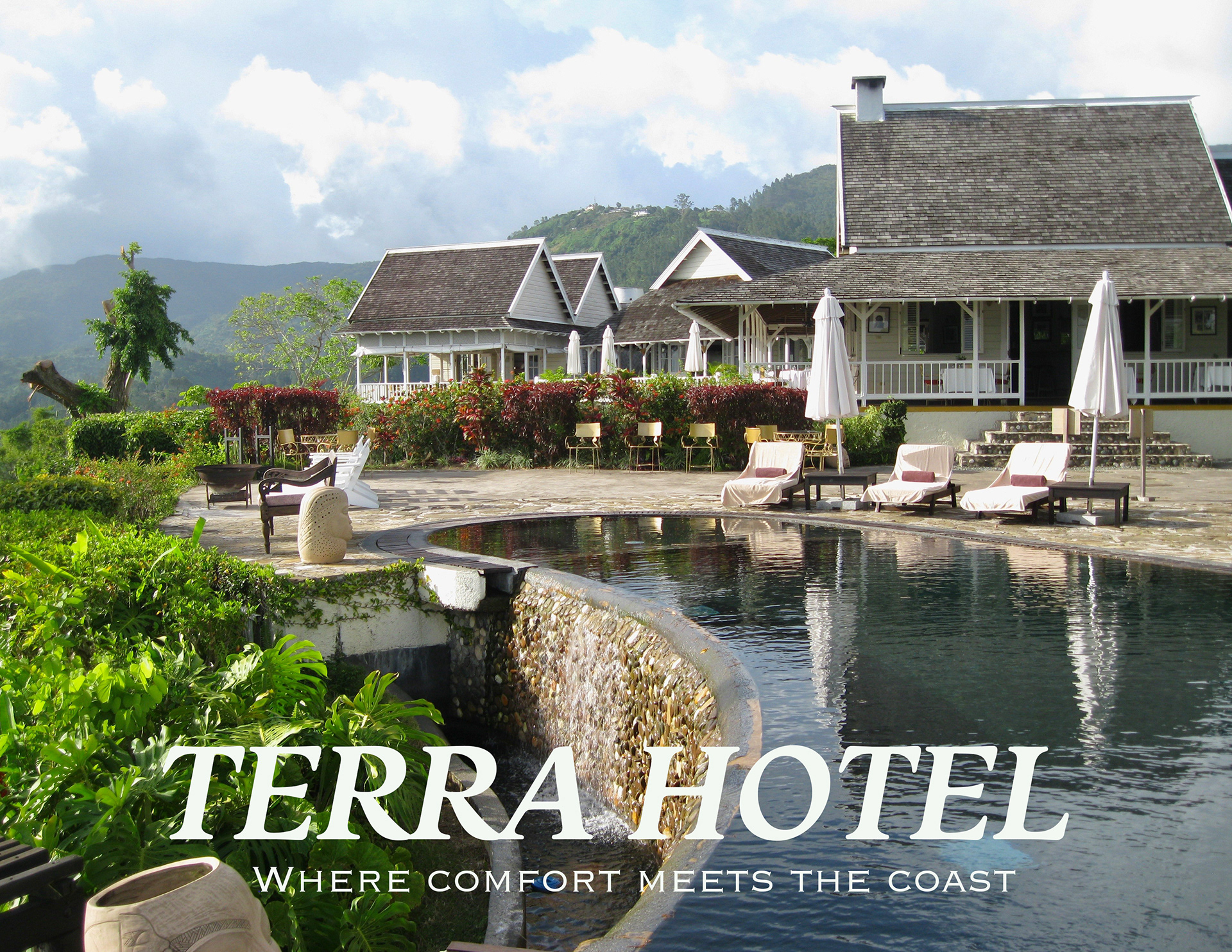
The goal of this assignment was to “sell an experience” through branding for a hotel or restaurant. Instead of designing around a product, the focus was on creating an emotional atmosphere — something a guest could feel through visuals, photography, and copywriting. I chose to create the brand identity for a boutique Caribbean hotel called Terra Hotel, inspired by nature, slow living, and local culture.
The goal of this assignment was to “sell an experience” through branding for a hotel or restaurant. Instead of designing around a product, the focus was on creating an emotional atmosphere — something a guest could feel through visuals, photography, and copywriting. I chose to create the brand identity for a boutique Caribbean hotel called Terra Hotel, inspired by nature, slow living, and local culture.
Tools Used
Adobe Photoshop, Adobe Illustrator, my original photography, color-grading techniques, and typography selection focused on warmth and elegance.
Adobe Photoshop, Adobe Illustrator, my original photography, color-grading techniques, and typography selection focused on warmth and elegance.
Project Description
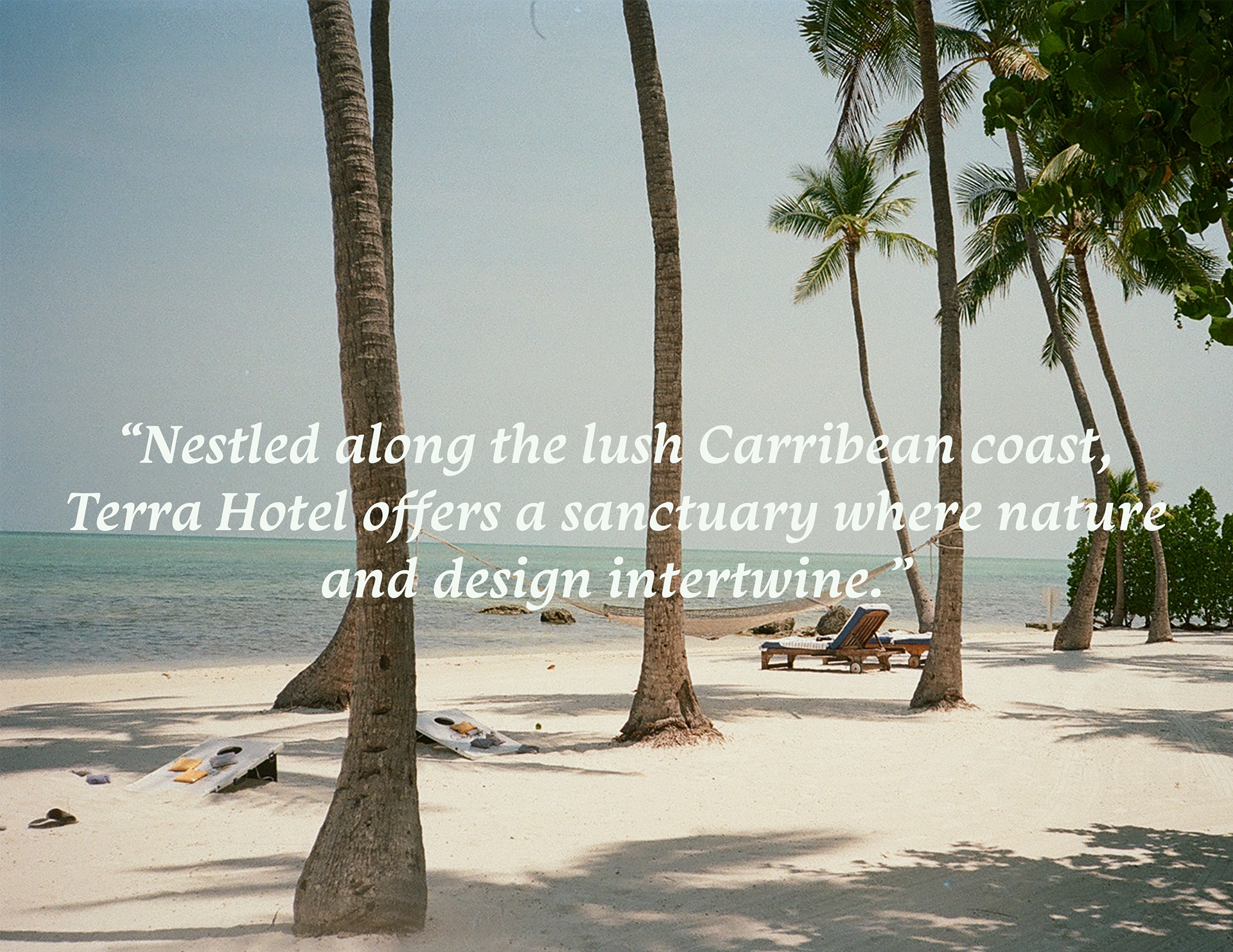
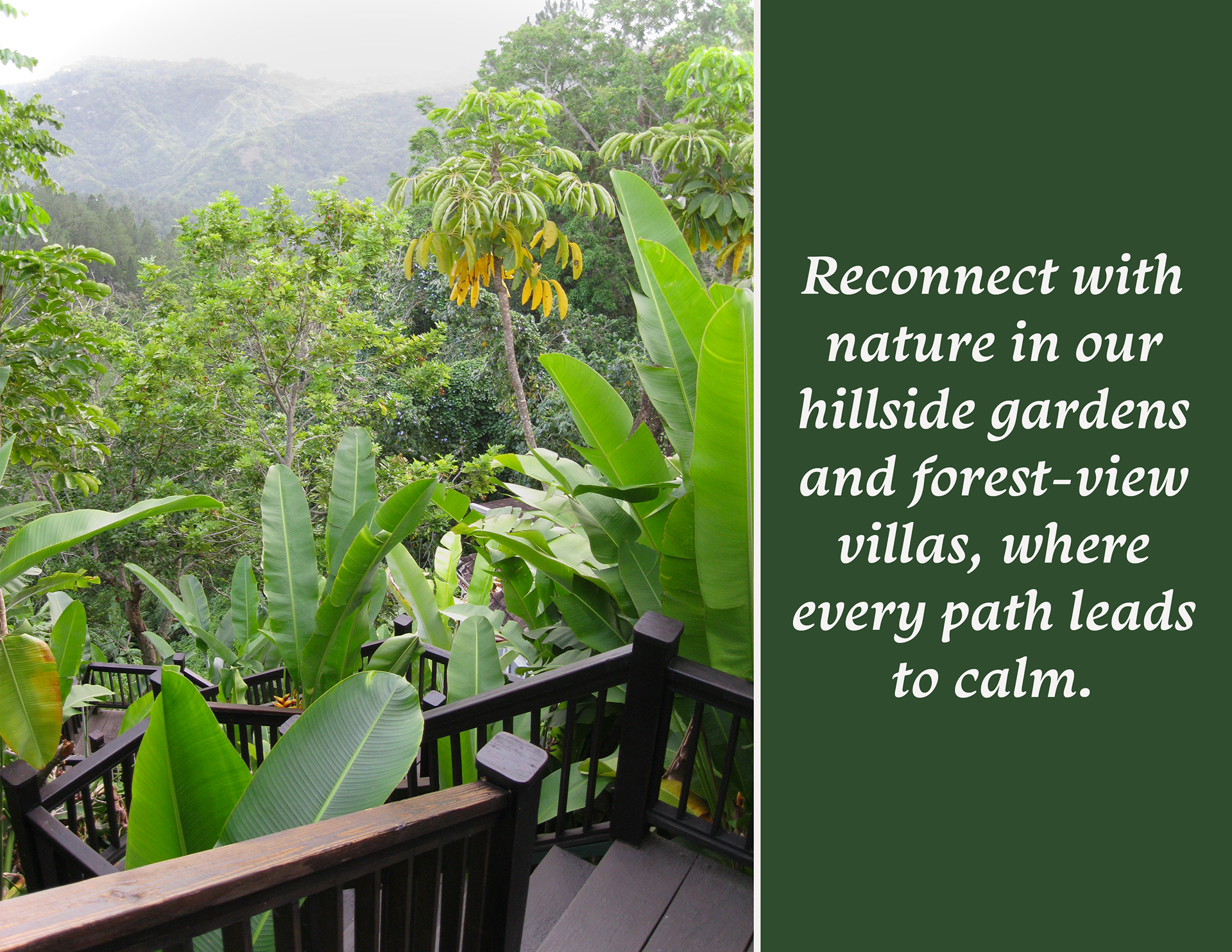
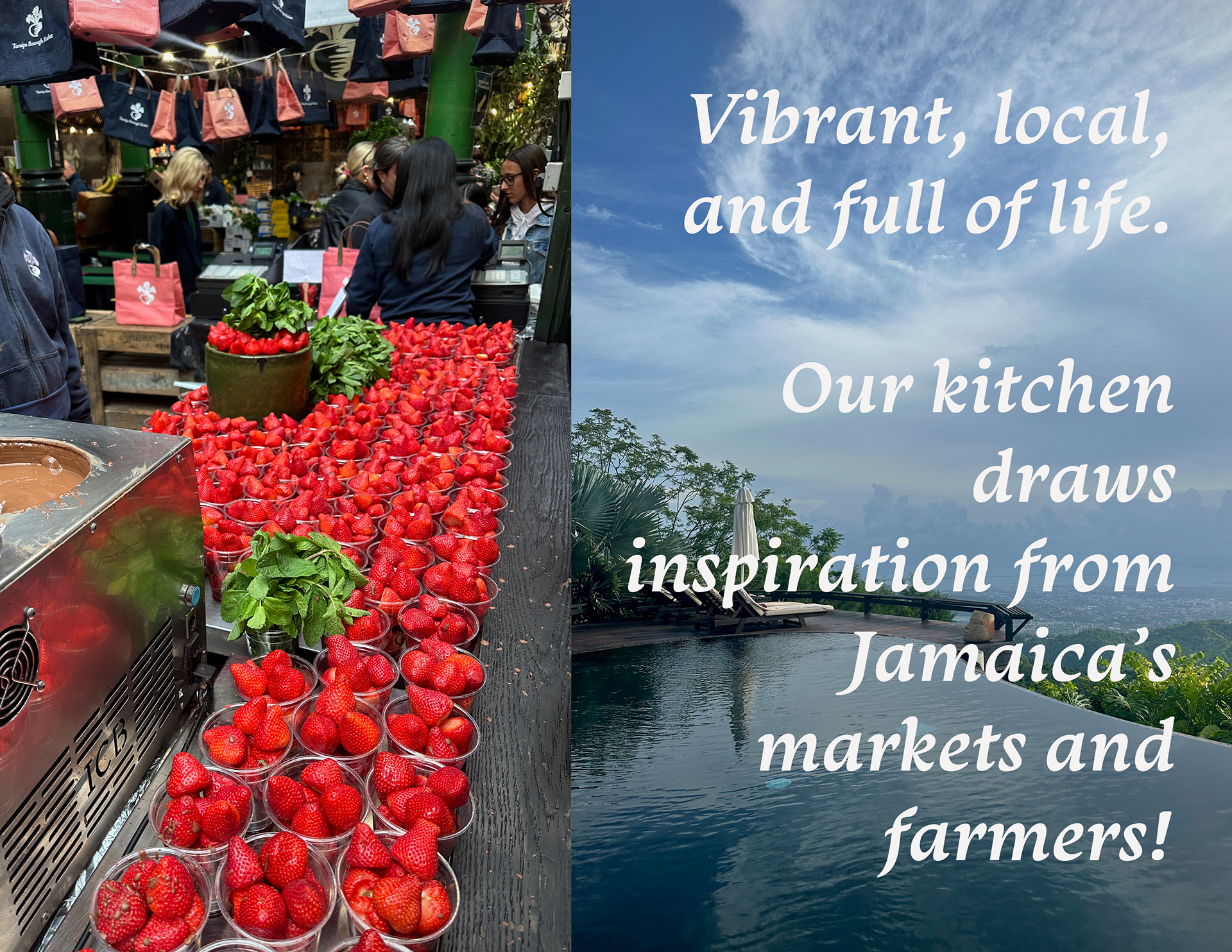
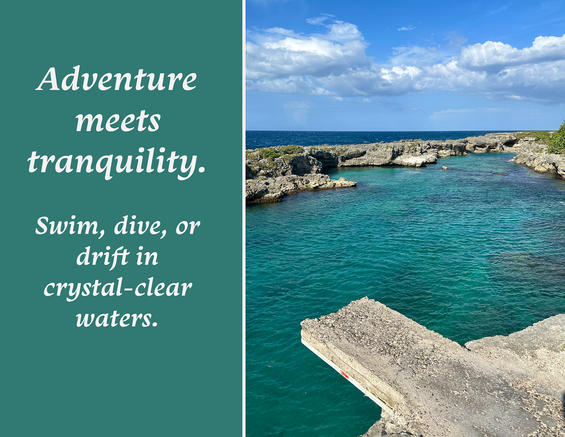
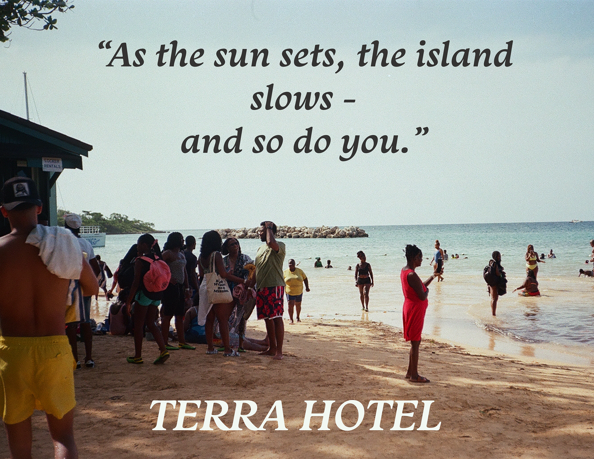
For this branding project, I built a full visual campaign that highlights Terra Hotel’s identity: a peaceful, nature-immersed escape where guests reconnect with authentic Caribbean beauty. Each slide blends photography with narrative copywriting to evoke specific emotions — comfort, stillness, connection, and adventure.
For this branding project, I built a full visual campaign that highlights Terra Hotel’s identity: a peaceful, nature-immersed escape where guests reconnect with authentic Caribbean beauty. Each slide blends photography with narrative copywriting to evoke specific emotions — comfort, stillness, connection, and adventure.
I photographed local foods, landscapes, and textures to build an authentic visual story. Typography choices helped reinforce the “relaxed luxury” feeling, pairing soft serif fonts with warm, earth-toned backgrounds. The copywriting leans heavily into sensory language, describing taste, atmosphere, and mood. Together, the visuals and writing create a cohesive brand experience.
Highlights From the Project
• A calm coastal poolside scene introducing the Terra Hotel brand as a sanctuary by the Caribbean coast
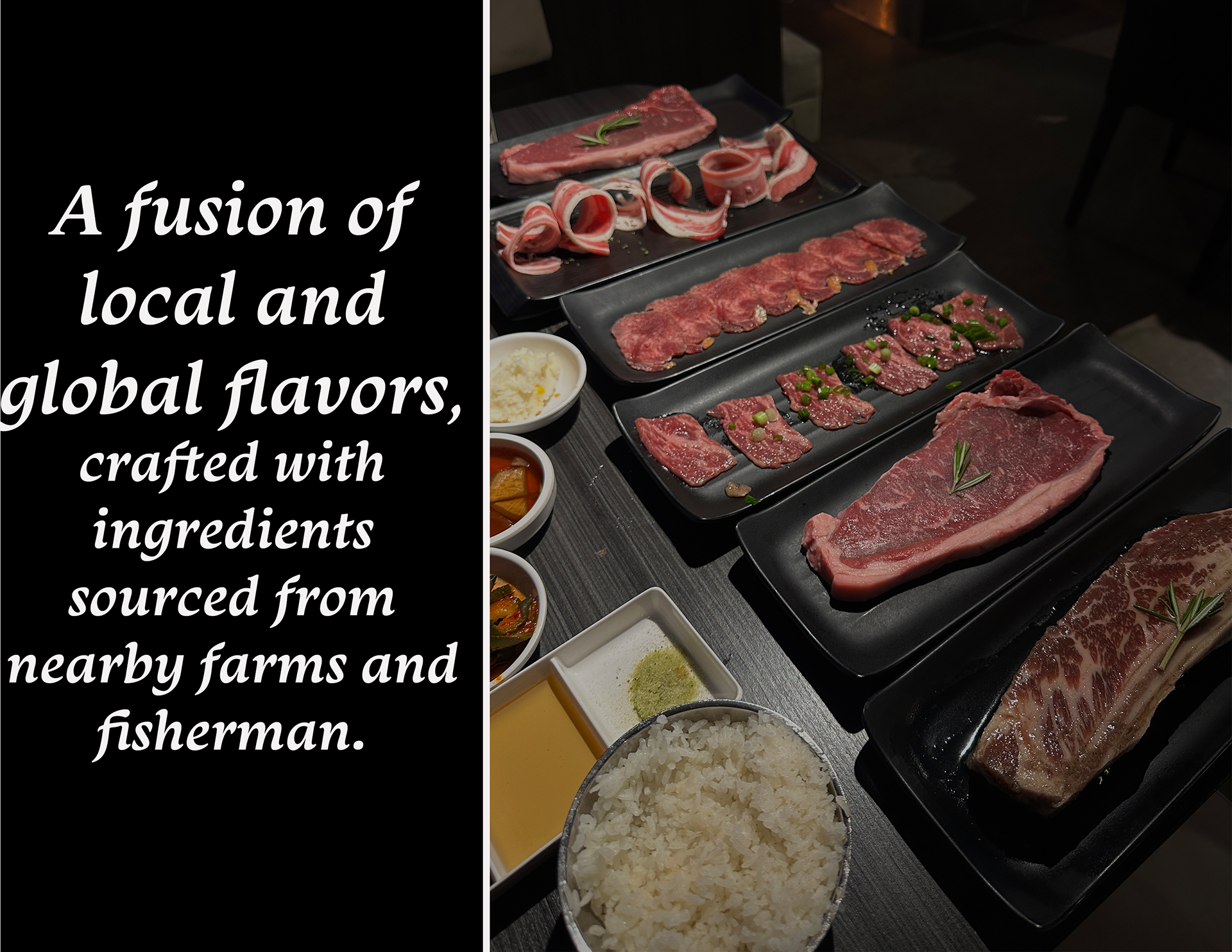
• A local-flavor food spread representing farm-to-table cuisine and the fusion of global and Jamaican influences
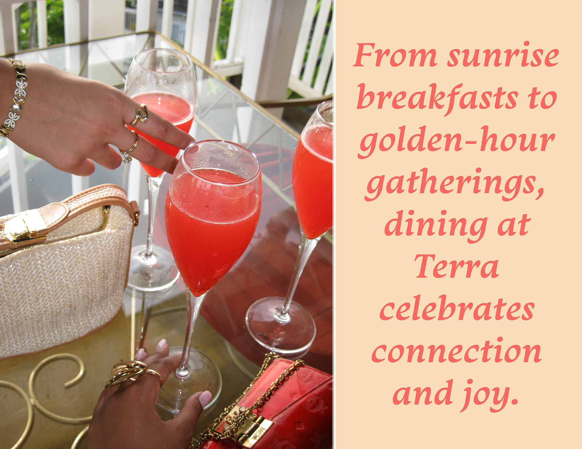
• A lifestyle moment showcasing golden-hour cocktails, celebrating connection and joy among guests
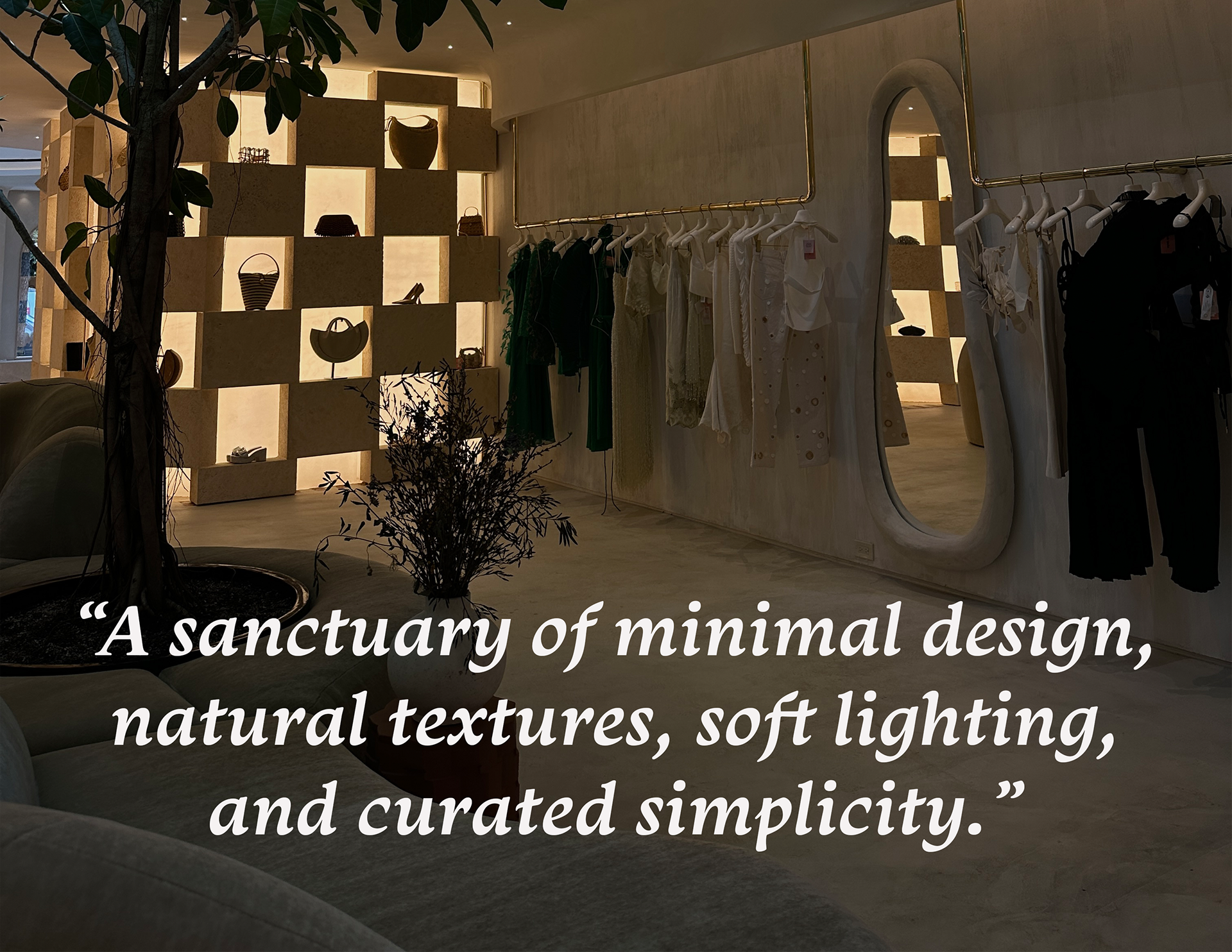
• A soft, minimal interior emphasizing curated design, natural textures, and warm lighting
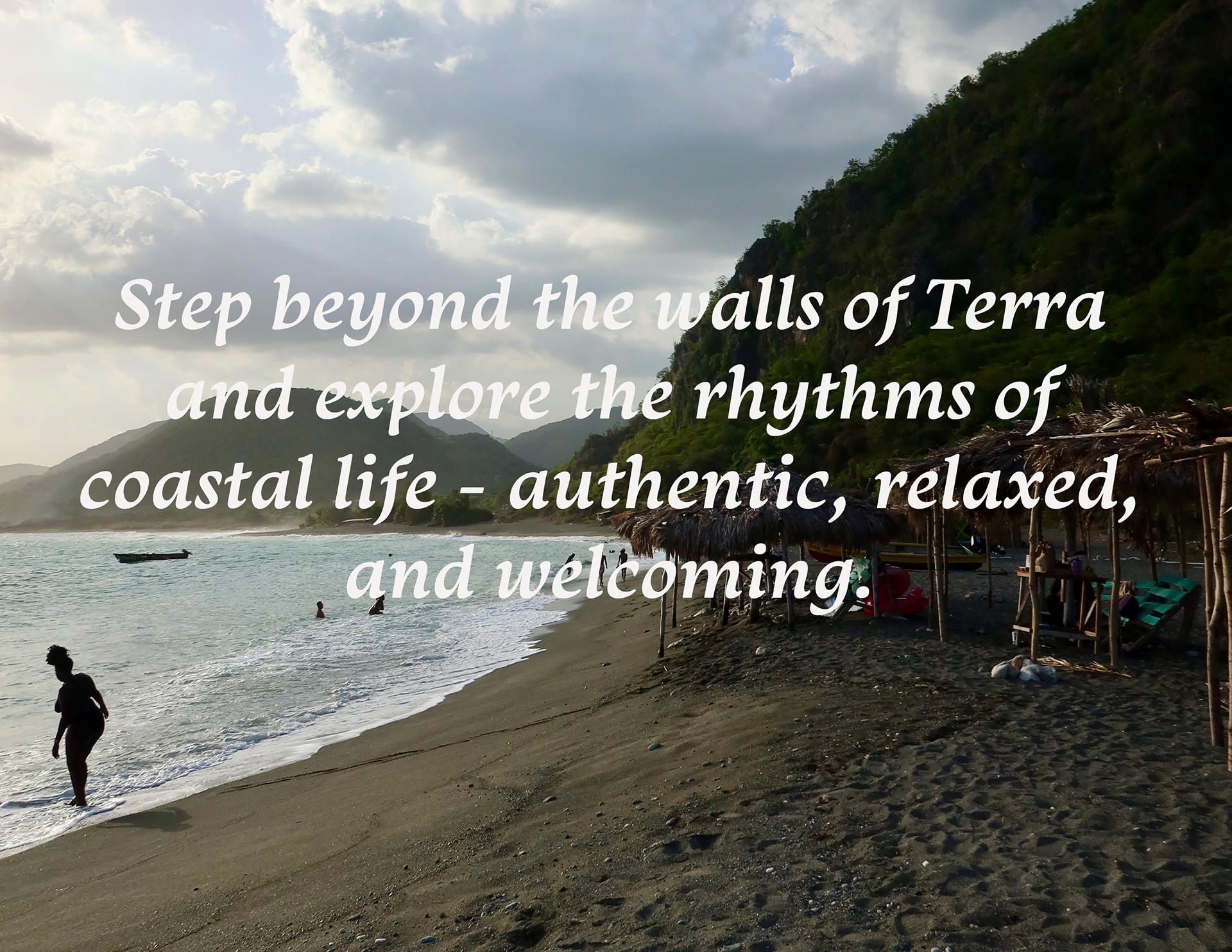
• An adventurous seaside image pairing rugged coastlines with peaceful turquoise waters
• A tranquil hillside garden inviting guests to reconnect with nature and slow down
• A sunset-on-the-beach scene capturing the soul of island living and the transition into calmness at the end of the day
• A local-flavor food spread representing farm-to-table cuisine and the fusion of global and Jamaican influences
• A lifestyle moment showcasing golden-hour cocktails, celebrating connection and joy among guests
• A soft, minimal interior emphasizing curated design, natural textures, and warm lighting
• An adventurous seaside image pairing rugged coastlines with peaceful turquoise waters
• A tranquil hillside garden inviting guests to reconnect with nature and slow down
• A sunset-on-the-beach scene capturing the soul of island living and the transition into calmness at the end of the day
Reflection
This assignment helped me understand how branding goes far beyond logos and colors. I learned how to craft a full emotional narrative — using photography, typography, and language to shape how a viewer feels. It strengthened my visual storytelling, copywriting, and ability to build a cohesive brand identity from scratch.
This assignment helped me understand how branding goes far beyond logos and colors. I learned how to craft a full emotional narrative — using photography, typography, and language to shape how a viewer feels. It strengthened my visual storytelling, copywriting, and ability to build a cohesive brand identity from scratch.
---------------------------------------------------------------------------------------------------------
A10 Book or Magazine
Briefing
The goal of this assignment was to design two completely different cover styles using photography, typography, and layout. We were allowed to choose from formats such as book covers, photo books, magazines, zines, or art books. I created one photography-focused book cover and one fashion-focused magazine cover.
The goal of this assignment was to design two completely different cover styles using photography, typography, and layout. We were allowed to choose from formats such as book covers, photo books, magazines, zines, or art books. I created one photography-focused book cover and one fashion-focused magazine cover.
Tools Used
I took original photos, combined and edited them in Photoshop using layer masking, CMYK color setup, and 300 DPI resolution. After that, I imported the artwork into Illustrator to add typography and refine the final layout.
I took original photos, combined and edited them in Photoshop using layer masking, CMYK color setup, and 300 DPI resolution. After that, I imported the artwork into Illustrator to add typography and refine the final layout.
Concept & Process
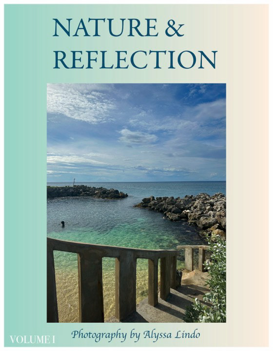
For the photo book, I chose a calming nature theme inspired by reflections, water, and coastal scenery. I wanted the design to feel soft, airy, and minimal, allowing the photography to be the centerpiece.
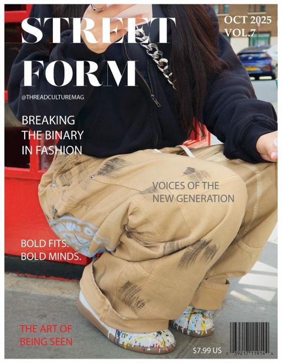
For the magazine cover, I went in the opposite direction, creating an urban, bold street-fashion aesthetic. The goal was to mimic real editorial design with strong typography, layered text, and a dynamic composition.
For the photo book, I chose a calming nature theme inspired by reflections, water, and coastal scenery. I wanted the design to feel soft, airy, and minimal, allowing the photography to be the centerpiece.
For the magazine cover, I went in the opposite direction, creating an urban, bold street-fashion aesthetic. The goal was to mimic real editorial design with strong typography, layered text, and a dynamic composition.
Reflection
This project pushed me to explore contrasting design languages — serene and minimalist versus bold and editorial. It also helped strengthen my skills in color correction, layout design, image masking, and typographic hierarchy.
This project pushed me to explore contrasting design languages — serene and minimalist versus bold and editorial. It also helped strengthen my skills in color correction, layout design, image masking, and typographic hierarchy.
---------------------------------------------------------------------------------------------------------
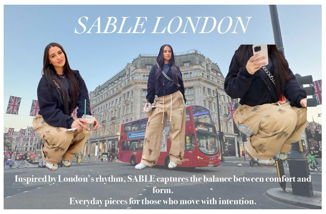
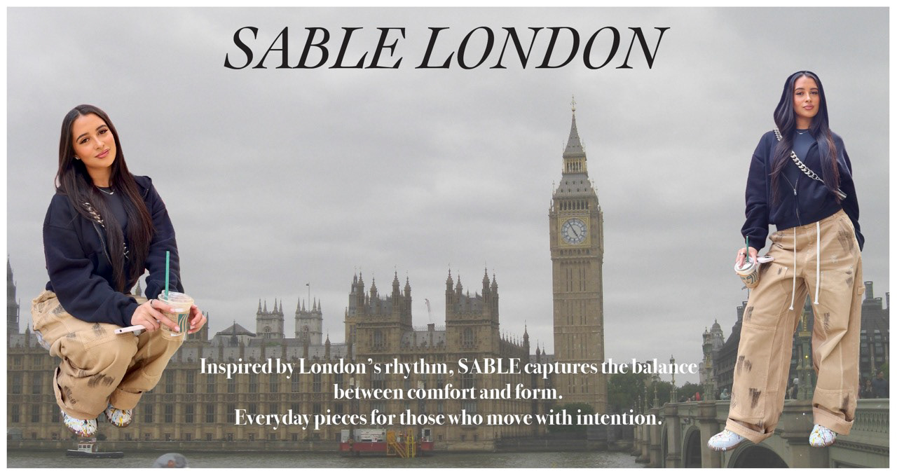
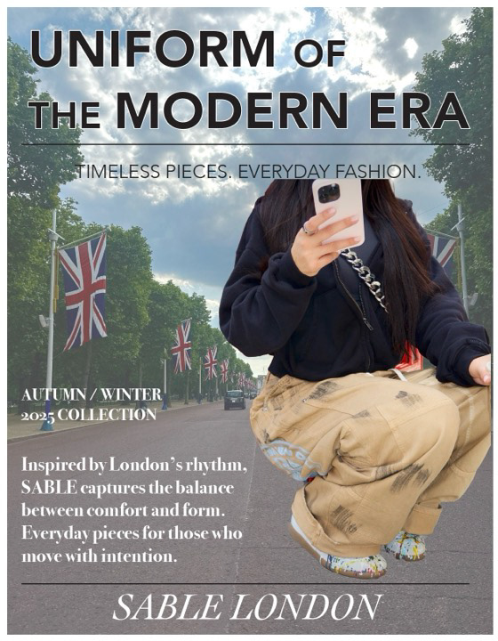
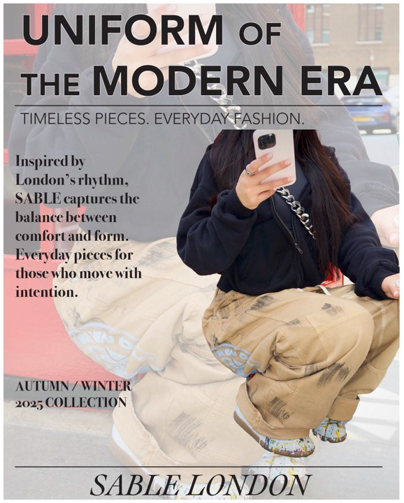
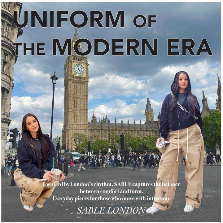
A12 Fashion Advertising Campaign
Briefing
For this assignment, I created a full multi-platform advertising campaign for my own fashion brand concept, Sable London. The goal was to design a cohesive visual identity that can translate across magazine layouts, social media, and digital ads.
For this assignment, I created a full multi-platform advertising campaign for my own fashion brand concept, Sable London. The goal was to design a cohesive visual identity that can translate across magazine layouts, social media, and digital ads.
Concept & Theme
Sable London is inspired by the rhythm of London life — fast, intentional, expressive, and modern. The brand blends comfort with structure, highlighting everyday pieces designed for people who move with purpose. The campaign focuses on the idea of a “modern uniform,” showcasing versatility and individuality.
Sable London is inspired by the rhythm of London life — fast, intentional, expressive, and modern. The brand blends comfort with structure, highlighting everyday pieces designed for people who move with purpose. The campaign focuses on the idea of a “modern uniform,” showcasing versatility and individuality.
Tools Used
I took my own photos and edited them in Photoshop to achieve a clean, editorial style. The main compositions were assembled in Illustrator, where I added typography, slogans, and supporting text. For each layout, I adapted the design to fit different dimensions, including full-page magazine ads, social posts, and wider digital formats.
Design Elements
I used consistent typography throughout the campaign to unify the brand. The headlines reinforce the brand message, and smaller text boxes provide context about Sable London’s aesthetic. The visuals highlight movement, layers, and the contrast of London’s city environment.
I used consistent typography throughout the campaign to unify the brand. The headlines reinforce the brand message, and smaller text boxes provide context about Sable London’s aesthetic. The visuals highlight movement, layers, and the contrast of London’s city environment.
Reflection
My campaign includes a full-page magazine ad, a half-page horizontal ad, Instagram square and vertical formats, a Facebook ad, and multiple alternate layouts. The overall design creates a strong identity for Sable London and tells the story of a modern fashion brand built around intentional everyday style.
My campaign includes a full-page magazine ad, a half-page horizontal ad, Instagram square and vertical formats, a Facebook ad, and multiple alternate layouts. The overall design creates a strong identity for Sable London and tells the story of a modern fashion brand built around intentional everyday style.
---------------------------------------------------------------------------------------------------------
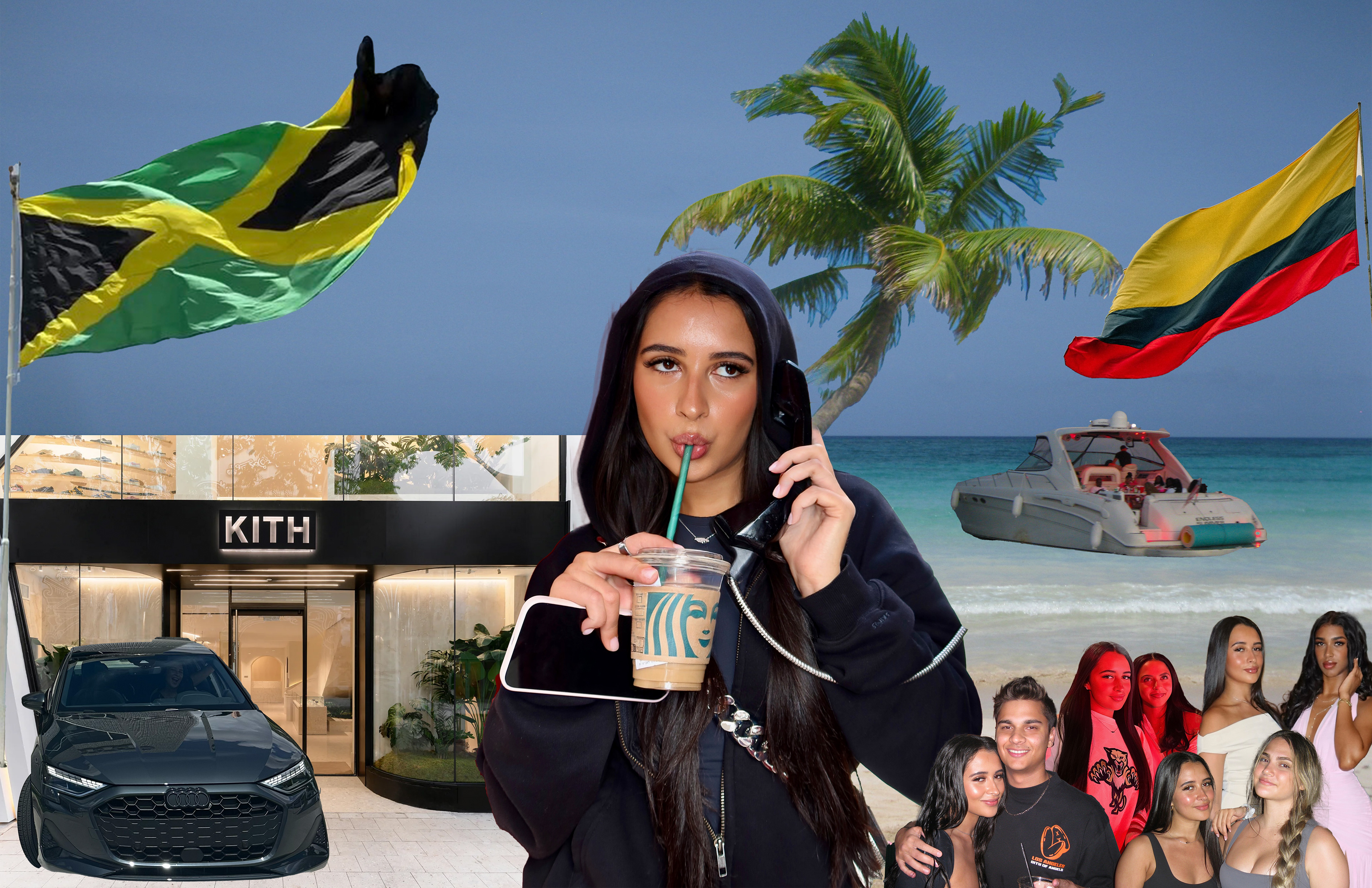
A14 Final Artwork
Project Type: Fine Art Digital Collage
Title: Fragments of Me
Title: Fragments of Me
Briefing
The goal was to create a complex fine-art digital collage using multiple photographs and advanced Photoshop techniques. It needed to communicate a personal message or self-expression. The final piece was built at 17x11 inches, 300 DPI, and showcased skills learned throughout the course.
The goal was to create a complex fine-art digital collage using multiple photographs and advanced Photoshop techniques. It needed to communicate a personal message or self-expression. The final piece was built at 17x11 inches, 300 DPI, and showcased skills learned throughout the course.
Tools used
Adobe Photoshop
Concept
I chose the theme “Fragments of Me” because I wanted the artwork to feel like a visual snapshot of my identity. Every element in the collage reflects something meaningful to me—my culture, my interests, the environments I spend time in, and the people who matter in my life. Instead of telling one story, the composition blends several pieces of my world into one frame.
I chose the theme “Fragments of Me” because I wanted the artwork to feel like a visual snapshot of my identity. Every element in the collage reflects something meaningful to me—my culture, my interests, the environments I spend time in, and the people who matter in my life. Instead of telling one story, the composition blends several pieces of my world into one frame.
Process
I used extensive layer masking, vector masking, smart objects, blending modes, and smart filters to merge all my images into a seamless fine-art composition. The project pushed me to think critically about composition, balance, and visual storytelling while still keeping the final piece personal.
I used extensive layer masking, vector masking, smart objects, blending modes, and smart filters to merge all my images into a seamless fine-art composition. The project pushed me to think critically about composition, balance, and visual storytelling while still keeping the final piece personal.
Reflection
The finished artwork combines culture, lifestyle, fashion, environment, and relationships into a single visual. It represents who I am today and what influences me, forming a collage of moments, places, and identities that shape me.
The finished artwork combines culture, lifestyle, fashion, environment, and relationships into a single visual. It represents who I am today and what influences me, forming a collage of moments, places, and identities that shape me.
---------------------------------------------------------------------------------------------------------